Tuesday, September 11, 2012

Principles of Design

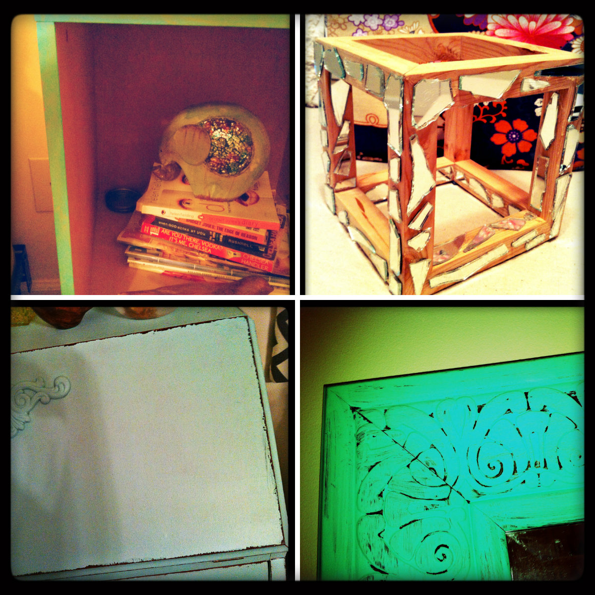
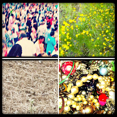
Here are picture illustrating the principles of design...


Symmetrical Balance
Each side mirrors the other. They create states of equilibrium.


Asymmetrical Balance. 
There are different items on both sides but together they create a balanced look.


Emphasis. 
Each picture has emphasis on one specific thing. When looking at the picture your eye goes to one specific detail. 


Movement. 
Details in the picture move your eye through the picture. Each picture has things that create idea of movement. 


Repetition and Rhythm.
Each picture has things that repeat but also create rhythm. 


Variety.
Each picture shows variety by the multiple aspect each one has. They are busy places with a lot going on but in their own way they create balance.

Thursday, September 6, 2012

Texture & Space


Here are examples of texture and space...


The first collage is examples of actual texture. You can see the texture, but it is also real. You can feel the difference in materials as well as see them. 


In this collage we have implied texture. They appear to have texture when really the surface is flat. It is meant to trick the eye into thinking if we touched it it would feel different when really its a flat surface. 


Here we have actual space. There are walls surrounding this furniture set up making it an actual space. The furniture also makes an actual space by outlining it. 

Last we have pictures of implied spaces. The chair implies that someone will sit there. There is space for someone to sit even though its not clearly seen. Then next is a pathway worn in by students passing. Even though it is not clearly marked it is a space, making it implied. The hallway and bridge are also implied spaces. 


Tuesday, September 4, 2012

          Hope you liked my links! I went for more of the companies that had more modern furniture and bright and exciting patterns. I love patterns and what they bring to a room. Mixing and matching them brings so much interest to a room when paired with simple furniture. My criteria consisted of both bright colors but also simple pieces. I like the eclectic feel with a modern twist. My favorite of all of these is probably South of Market. I heard about it from one of the older girls and literally loved it! The rustic style appeals to my love for antiques, but at the same time the lines are more modern and simplistic. They also throw some bright colors in here or there. There is definitely a range of style from this website and it was awesome to look at!

Monday, September 3, 2012

Plane. Form. Texture. Space.


Here are some examples of form... 
First we have geometric form, they are closed forms that represent a recognizable shape. 


Next we have natural form, which mimicks natural forms that exist in real life. 


Next we have examples of planes. They are continuous lines that create shapes. 


Abstract forms are my favorite. You can kind of tell what they are but at the 
same time they present a mystery as to what they really are. 


Static forms show no movement but are mostly full of consistent lines that all run the same way. 
There is no interest when it comes to static, its uniform and boring. 


Dynamic forms are more fun than static. They show movement even if they are not 3D.

Here are two non-objective forms. To us they are unable to be described as anything recognizable. 


Thursday, August 30, 2012

Line. Shape. Point.

Here are the pictures I took on my stroll downtown. There are so many cool things to see in Athens,  here are a few I thought were worth capturing....


Implied Lines.
Each picture has lines that are there but not totally. 
Together they act as a single line that draws your eye.


Vertical Lines.
Each of the pictures have vertical lines that draw your eye upwards.
They give structure to the prints.


Images of Point.
Each image has a point of interest.
In every picture there is one thing that your eye automatically focuses on. 


Horizontal Lines.
The horizontal lines in each image add calm to the picture.
Even when the image is busy, the horizontal lines add order.


Diagonal Lines.
These lines are fun and interesting.
They add interest and make your eyes follow.


Geometric Shapes.
These are all examples of geometric shapes but with a twist. 


Natural Shapes.
Each picture has shapes we can only think of as natural. 


Organic Lines.
The organic lines of these pictures are great. 
The architecture adds a whimsical feel and adds interest.


Structural Lines. 
The lines in these pictures are structural. 
They connect pieces together and add stability.


Non- Representational Images
They are really cool to look at. 
They make you think about where they came from and what they really are. 


Abstract Images
They are definitely among my favorite. 
I love the interest they cause and the presentation of these pictures.

Wednesday, August 22, 2012

Beauty at its finest...

           In the world there are different types of beauty. There is normally defined beauty, and there is unexpected beauty. For the normal, we have things that have always been considered beautiful. Jewels, Nature, Flowers, Art... these are all normal beauty. Culturally current beauty can be found in the looks of celebrities, or the newest fashion trend. What we see as beautiful depends on the times and culture. For unexpected beauty it is the things that we see as beautiful which surprise us. Maybe graffiti on a wall, or trash turned into treasure. Things that are not usually considered beautiful can be translated into something mind blowing and because the beauty is so unexpected it is even more satisfying and draws our attention. Beauty also depends on the person. Something that has always been beautiful to one person, could be totally unexpectedly beautiful to another. Its the pleasant surprise that makes unexpected beauty special.


                                                                                            blog.ivman.com

Style...

          Of the designers below Eric Cohler is my favorite one. His style is very similar to mine and what appeals to me. His use of white walls with accent colors is amazing. I love the sleek contemporary lines but also the feel of the colors and textiles that he uses. I love the modern furniture he uses, but that he keeps also a vintage feel. Also his use of very colorful and eye drawing art adds interest to room and his white walls make it pop. All around I love his design style.


            All of the designers I chose have a similar style to Eric Cohler. I love their contemporary style and their use of color to bring everything together. Clean lines bring calm to a room, while patterned textiles and bright furniture and accents make the room interesting and homey, taking away the sterile feeling white walls can sometimes bring. All of the designers use interesting art on their walls which I love. For me, I love to walk into a room, and feel at home but also impressed by how a room is put together. All of these designers use color to bring their rooms together and give them character. They are all beautiful  translations.